

The Obscuration of Health Hazards:
An Analysis of EPA Air Quality Standards
by
Clifford E Carnicom
Mar 12 2016
A discrepancy between measured and observed air quality in comparison to that reported by the U.S. Environmental Protection Agency under poor conditions in real time has prompted an inquiry into the air quality standards in use by that same agency. This analysis, from the perspective of this researcher, raises important questions about the methods and reliability of the data that the public has access to, and that is used to make decisions and judgements about the surrounding air quality and its impact upon human health. The logic and rationale inherent within these same standards are now also open to further examination. The issues are important as they have a direct influence upon the perception by the public of the state of health of the environment and atmosphere. The purpose of this paper is to raise honest questions about the strategies and rationales that have been adopted and codified into our environmental regulatory systems, and to seek active participation by the public in the evaluation process. Weaknesses in the current air quality standards will be discussed, and alternatives to the current system will be proposed.
Particulate Matter (PM) has an important effect upon human health. Currently, there are two standards for measuring the particulate matter in the atmosphere, PM 10 and PM 2.5. PM 10 consists of material less than 10 microns in size and is often composed of dust and smoke particles, for example. PM 2.5 consists of materials less than 2.5 microns in size and is generally invisible to the human eye until it accumulates in sufficient quantity. PM 2.5 material is considered to be a much greater risk to human health as it penetrates deeper into the lungs and the respiratory system. This paper is concerned solely with PM 2.5 pollution.
As an introduction to the inquiry, curiosity can certainly be called to attention with the following statement by the EPA in 2012, as taken from a document (U.S. Environmental Protection Agency 2012,1) that outlines certain changes made relatively recently to air quality standards:
“EPA has issued a number of rules that will make significant strides toward reducing fine particle pollution (PM 2.5). These rules will help the vast majority of U.S. counties meet the revised PM 2.5 standard without taking additional action to reduce emissions.”
Knowing and studying the “rule changes” in detail may serve to clarify this statement, but on the surface it certainly conveys the impression of a scenario whereby a teacher changes the mood in the classroom by letting the students know that more of them will be passing the next test. Even better, they won’t need to study any harder and they will still get the same result.
In contrast, the World Health Organization (WHO) is a little more direct (World Health Organization 2013, 10) about the severity and impact of fine particle pollution (PM 2.5):
“There is no evidence of a safe level of exposure or a threshold below which no adverse health effects occur. The exposure is ubiquitous and involuntary, increasing the significance of this determinant of health.”
We can, therefore, see that there are already significant differences in the interpretation of the impact of fine particle pollution (especially from an international perspective), and that the U.S. EPA is not exactly setting a progressive example toward improvement.
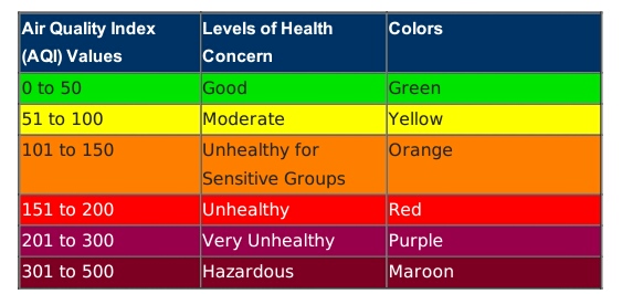
Another topic of introductory importance is that of the AQI, or “Air Quality Index” that has been adopted by the EPA (“Air Quality Index – Wikipedia, the Free Encyclopedia” 2016). This index is of the “idiot light” or traffic light style, where green means all is fine, yellow is to exercise caution, and red means that we have a problem. The index, therefore, has the following appearance:
There are other countries that use a similar type of index and color-coded scheme. China, for example, uses the following scale (“Air Quality Index – Wikipedia, the Free Encyclopedia” 2016):
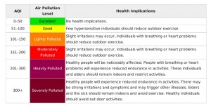
As we continue to examine these scale variations, it will also be of interest to note that China is known to have some of the most polluted air in the world, especially over many of the urban areas.
Not all countries, jurisdictions or entities , however, use the idiot light approach that employs an arbitrary scaling method that is removed from showing the actual PM 2.5 pollution concentrations, such as those shown from the United States and China above. For example, the United Kingdom uses a scale (“Air Quality Index – Wikipedia, the Free Encyclopedia” 2016) that is dependent upon actual PM 2.5 concentrations, as is shown below:
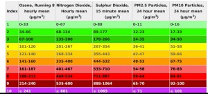
Notice that the PM 2.5 concentration for the U.K. index is directly accessible and that the scaling for the index is dramatically different than that for the U.S. or China. In the case of the AQI used by the U.S. and China (and other countries as well), a transformed scale runs from 0 to 300-500 with concentration levels that are generally more obscure and ambiguous within the index. In the case of the U.K index, the scale directly reports with a specific PM 2.5 concentration level with a maximum (i.e., ~70 ug/m^3) that is far below that incorporated into the AQI index (i.e., 300 – 500 ug/m^3).
We can be assured that if a reading of 500 ug/m^3 is ever before us, we have a much bigger problem on our hands than discussions of air quality. The EPA AQI is heavily biased toward extreme concentration levels that are seldom likely to occur in practical affairs; the U.K. index gives much greater weight to the lower concentration levels that are known to directly impact health, as reflected by the WHO statement above.
Major differences in the scaling of the indices, as well as their associated health effects, are therefore hidden within the various color schemes that have been adopted by various countries or jurisdictions. Color has an immediate impact upon perception and communication; the reality is that most people will seldom, if ever, explore the basis of such a system as long as the message is “green” under most circumstances that they are presented with. The fact that one system acknowledges serious health effects at a concentration level of 50 – 70 ug/m^3 and that another does not do so until the concentration level is on the order of 150 – 300 ug/m^3 is certainly lost to the common citizen, especially when the scalings and color schemes chosen obscure the real risks that are present at low concentrations.
The EPA AQI system appears to have its roots in history as opposed to simplicity and directness in describing the pollution levels of the atmosphere, especially as it relates to the real-time known health effects of even short-term exposure to lower concentration PM 2.5 levels. The following statement (“Air Quality Index | World Public Library” 2016) acknowledges weaknesses in the AQI since its introduction in 1968, but the methods are nevertheless perpetuated for more than 45 years.
“While the methodology was designed to be robust, the practical application for all metropolitan areas proved to be inconsistent due to the paucity of ambient air quality monitoring data, lack of agreement on weighting factors, and non-uniformity of air quality standards across geographical and political boundaries. Despite these issues, the publication of lists ranking metropolitan areas achieved the public policy objectives and led to the future development of improved indices and their routine application.”
The system of color coding to extreme and rarified levels with the use of an averaged and biased scale versus one that directly reports the PM 2.5 concentration levels in real time is an artifact that is divorced from current observed measurements and the knowledge of the impact of fine particulates upon human health.
The reporting of PM 2.5 concentrations directly along with a more realistic assessment of impact upon human health is hardly unique to the U.K. index system. With little more than casual research, at least three other independent systems of measurement have been identified that mirror the U.K. maximum scaling levels along with the commensurate PM 2.5 counts. These include the World Health Organization, a European environmental monitoring agency, and a professional metering company index scale (World Health Organization 2013, 10) (“Air Quality Now – About US – Indices Definition” 2016) (“HHTP21 Air Quality Meter, User Manual, Omega Engineering” 2016, 10).
.
As another example to gain perspective between extremes and maximum “safe” levels of PM 2.5 concentrations, we can recall an event that occurred in Beijing, China during November 2010, and that was reported by the New York Times in January of 2013 (Wong 2013) . During this extreme situation, the U.S. Embassy monitoring equipment registered a PM 2.5 reading of 755, and the story certainly made news as the levels blew out any scale imaginable, including those that set maximums at 500.
An after statement within the article that references the World Health Organization standards may be the lasting impression that we should carry forward from the horrendous event, where it is stated that:
“The World Health Organization has standards that judge a score above 500 to be more than 20 times the level of particulate matter in the air deemed safe.”
Not withstanding the fact that WHO also states that no there is no evidence of any truly “safe” level of particulate matter in the atmosphere, we can nevertheless back out of this statement that a maximum “safe” level for the PM 2.5 count, as assessed by WHO, is approximately 25 ug / m^3. This statement alone should convince us that we must pay close attention to the lower levels of pollution that enter into the atmosphere, and that public perception should not be distorted by scales and color schemes that usually only affect public perception when they number into the hundreds.
Let us gain a further understanding of how low concentration levels and small changes affect human health and, shall I daresay, mortality. The case for low PM 2.5 concentrations being seriously detrimental to human health is strong and easy to make. Casual research on the subject will uncover a host of research papers that quantify increased mortality rates with direct relationship to small changes in PM 2.5 concentrations, usually expressing a change in mortality per 10 ug / m^3. Such papers are not operating in the arena of scores to hundreds of micrograms per cubic meter, but on the order of TEN micrograms per cubic meter. This work underscores the need to update the air quality standards, methods and reporting to the public based upon current health knowledge, instead of continuing a system of artifacts based upon decades old postulations.
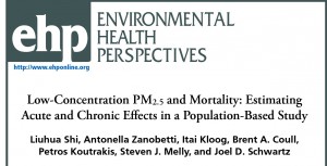
These papers will refer to both daily mortality levels as well as long term mortality based upon these “small” increases in PM 2.5 concentrations. The numbers are significant from a public health perspective. As a representative article, consider the following recent published paper in Environmental Health Perspectives in June of 2015, under the auspices of the National Institute of Environmental Health Sciences(Shi et al. 2015) :
with the following conclusions:
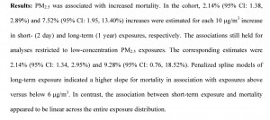
as based upon the following results:
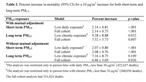
Let us therefore assume a more conservative increase of 2% mortality for a short-term exposure (i.e., 2 day) per TEN (not 12, not 100, not 500 per AQI scaling) micrograms per cubic meter. Let us assume a mortality increase of 7% for long term exposure (i.e, 365 days).
Let us put these results into further perspective. A sensible question to ask is, given a certain level of fine particulate pollution introduced into the air for a certain number of days within the year, how many people would die as a consequence of this change in our environment? We must understand that the physical nature of the particulates is being ignored here (e.g., toxicity, solubility, etc.) other than that of the size being less than 2.5 microns.
The data results suggest a logarithmic form of influence, i.e. a relatively large effect for short term exposures, and a subsequently more gradual impact for long term exposure. A linear model is the simplest approach, but it also is likely to be too modest in modeling the mortality impact. For the purpose of this inquiry, a combined linear-log approach will be taken as a reasonably conservative approach.
The model developed, therefore, is of the form:
Mortality % Increase (per 10ug/m^3) = 1.65 +. 007(days) + 0.48 * ln(days)
The next step is to choose the activity level and time period for which we wish to model the mortality increase. Although any scenario within the data range could be chosen, a reasonably conservative approach will also be adopted here. The scenario chosen will be to introduce 30 ug/m^3 of fine particulate matter into the air for 10% of the days within a year.
The model will therefore estimate a 3.6% increase in mortality for 10 ug/ m^3 of introduced PM 2.5 materials (36.5 days). For 30 ug/m^3, we will therefore have a a 10.9% increase in mortality. As we can see, the numbers can quickly become significant, even with relatively low or modest PM 2.5 increases in pollution.
Next we transform this percentage into real numbers. During the year of 2013, the Centers for Disease Control (CDC) reports that 2,596,993 people died during that year from all causes combined (“FastStats” 2016). The percentage of 10.9% increase applied to this number results in 283, 072 additional projected deaths per year.
Continuing to place this number into perspective, this number exceeds the number of deaths that result from stroke, Alzheimer’s, and influenza and pneumonia combined (i.e, 5th, 6th, and 8th leading causes of death) during that same year. The number is also much higher than the death toll for Chronic Pulmonary Obstructive Disease (COPD), which is now curiously the third leading cause of death.
We should now understand that PM 2.5 pollution levels are a very real concern with respect to public health, even at relatively modest levels. Some individuals might argue that such a scenario could never occur, as the EPA has diminished the PM 2.5 standard on an annual basis down to 12 ug/m^3. The enforcement and sensitivity of that measurement standard is another discussion that will be reserved for a later date. Suffice it to say that the scenario chosen here is not unduly unrealistic here for consideration, and that it is in the public’s interest to engage themselves in this discussion and examination.
The next issue of interest to discuss is that of a comparison between different air quality scales in some detail. In particular, the “weighting”, or influence, of lower concentration levels vs. higher concentration levels will be examined. This topic is important because it affects the interpretation by the public of the state of air quality, and it is essential that the impacts upon human health are represented equitably and with forthrightness.
The explanation of this topic will be considerably more detailed and complex than the former issues of “color coding” and mortality potentials, but it is no less important. The results are at the heart of the perception of the quality of the air by the public and its subsequent impact upon human health.
To compare different scales of air quality that have been developed; we must first equate them. For example, if one scale ranges from 1 to 6, and another from 0 to 10, we must “map”, or transform them such that the scales are of equivalent range. Another need in the evaluation of any scale is to look at the distribution of concentration levels within that same scale, and to compare this on an equal footing as well. Let us get started with an important comparison between the EPA AQI and alternative scales that deserve equal consideration in the representation of air quality.
Here is the structure of the EPA AQI in more detail (U.S. Environmental Protection Agency 2012, 4) .
| AQI Index | AQI Abitrary Numeric | AQI Rank | PM 2.5 (ug/m^3) 24 hr avg. |
| Good | 0-50 | 1 | 0-12 |
| Moderate | 51-100 | 2 | 12.1-35.4 |
| Unhealthy for Sensitive Groups | 101-150 | 3 | 35.5-55.4 |
| Unhealthy | 151-200 | 4 | 55.5-150.4 |
| Very Unhealthy | 201-300 | 5 | 150.5-250.4 |
| Hazardous | 301-500 | 6 | 250.5-500 |
Now let us become familiar with three alternative scaling and health assessment scales that are readily available and that acknowledge the impact of lower PM 2.5 concentrations to human health:
| United Kingdom Index | U.K. Nomenclature | PM 2.5 ug/m3 24 hr avg. |
| 1 | Low | 0-11 |
| 2 | Low | 12-23 |
| 3 | Low | 24-35 |
| 4 | Moderate | 36-41 |
| 5 | Moderate | 41-47 |
| 6 | Moderate | 48-53 |
| 7 | High | 54-58 |
| 8 | High | 59-64 |
| 9 | High | 65-70 |
| 10 | Very High | >=71 |
Now for a second alternative air quality scale, this being from Air Quality Now, a European monitoring entity:
| Air Quality Now EU Rank | Nomenclature | PM 2.5 Hr | PM 2.5 24 Hrs. |
| 1 | Very Low | 0-15 | 0-10 |
| 2 | Low | 15-30 | 10-20 |
| 3 | Medium | 30-55 | 20-30 |
| 4 | High | 55-110 | 30-60 |
| 5 | Very High | >110 | >60 |
And lastly, the scale from a professional air quality meter manufacturer:
| Professional Meter Index | Nomenclature | PM 2.5 ug/m^3 Real Time Concentration |
| 0 | Very Good | 0-7 |
| 1 | Good | 8-12 |
| 2 | Moderate | 13-20 |
| 3 | Moderate | 21-31 |
| 4 | Moderate | 32-46 |
| 5 | Poor | 47-50 |
| 6 | Poor | 52-71 |
| 7 | Poor | 72-79 |
| 8 | Poor | 73-89 |
| 9 | Very Poor | >90 |
We can see that the only true common denominator between all scaling systems is the PM 2.5 concentration. Even with the acceptance of that reference, there remains the issue of “averaging” a value, or acquiring maximum or real time values. Setting aside the issue of time weighting as a separate discussion, the most practical means to equate the scaling system is to do what is mentioned earlier: First, equate the scales to a common index range (in this case, the EPA AQI range of 1 to 6 will be adopted). Second, inspect the PM 2.5 concentrations from the standpoint of distribution, i.e., evaluate these indices as a function of PM 2.5 concentrations. The results of this comparison follow below, accepting the midpoint of each PM 2.5 concentration band as the reference point:
| PM 2.5 (ug/m^3) | EPA AQI | UK | EU (1hr) | Meter |
| 1-10 | 1 | 1 | 1 | 1 |
| 10-20 | 2 | 1.6 | 1 | 2.1 |
| 20-30 | 2 | 2.1 | 2.2 | 2.7 |
| 30-40 | 2 | 2.1 | 3.5 | 3.2 |
| 40-50 | 3 | 3.2 | 3.5 | 3.2 |
| 50-60 | 3 | 4.3 | 3.5 | 4.3 |
| 60-80 | 4 | 5.4 | 4.8 | 4.9 |
| 80-100 | 4 | 6 | 4.8 | 6 |
| 100-150 | 4 | 6 | 6 | 6 |
| 150-200 | 4 | 6 | 6 | 6 |
| 200-250 | 5 | 6 | 6 | 6 |
| 250-300 | 5 | 6 | 6 | 6 |
| 300-400 | 6 | 6 | 6 | 6 |
| 400-500 | 6 | 6 | 6 | 6 |
This table reveals the essence of the problem; the skew of the EPA AQI index toward high concentrations that diminishes awareness of the health impacts from lower concentrations can be seen within the tabulation.
This same conclusion will be demonstrated graphically at a later point.
Now that all air quality scales are referenced to a common standard, i.e., the PM 2.5 concentration), the general nature of each series can be examined via a regression analysis. It will be found that a logistical function is a favored functional form in this case and the results of that analysis are as follows:
EPA Index (1-6) = 5.57 / (1 + 2.30 * exp(-.016 * PM 2.5))
Mean Square Error = 0.27
Mean (UK – EU – Meter) Index (1-6) = 6.03 / (1 + 5.65 * exp(-.046 * PM 2.5))
Mean Square Error = 0.01
The information that will now be of value to evaluate the weighting distribution applied to various concentration levels is that of integration of the logistical regression curves as a function of bandwidth. The result of the integration process (Int.) applied to the above regressions is as follows:
| PM 2.5 Band | EPA AQI (Int.) [Index * PM 2.5] |
Mean Index (Int.) (UK-EU-Meter) [Index * PM 2.5] |
% Relative Overweight or Underweight of PM 2.5 Band Contribution Between EPA AQI and Mean Alternative Air Quality Index Scale (Endpoint Bias Removed) |
| 1-10 | 16.1 | 10.1 | +42% |
| 10-20 | 19.8 | 15.8 | +27% |
| 20-30 | 21.9 | 21.6 | +8% |
| 30-40 | 24.1 | 28.3 | -10% |
| 40-50 | 26.3 | 35.2 | -27% |
| 50-60 | 28.5 | 41.5 | -39% |
| 60-80 | 63.6 | 98.0 | -47% |
| 80-100 | 72.1 | 110.4 | -46% |
| 100-150 | 211.7 | 295.0 | -32% |
| 150-200 | 243.7 | 300.8 | -16% |
| 200-250 | 261.7 | 301.4 | -8% |
| 250-300 | 270.7 | 301.5 | -4% |
| 300-400 | 551.8 | 603.0 | -2% |
| 400-500 | 555.9 | 603.0 | 0% |
A graph of a regression curve to the % Relative Overweight/Underweight data in the final column of the table above is as follows (band interval midpoints selected; standard error = 4.1%).
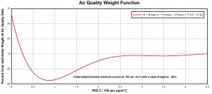
And, thus, we are led to another interpretation regarding the demerits of the EPA AQI. The EPA AQI scaling system unjustifiably under-weights the harmful effects of PM 2.5 concentrations that are most likely to occur in real world, real time, daily circumstances. The scale over-weights the impacts of extremely low concentrations that have little to no impact upon human health. And lastly, when the PM 2.5 concentrations are at catastrophic levels and the viability of life itself is threatened, all monitoring sources, including the EPA, are in agreement that we have a serious situation. One must seriously question the public service value under such distorted and disproportionate representation of this important monitor of human health, the PM 2.5 concentration.
Let us proceed to an additional serious flaw in the EPA air quality standards, and this is the issue of averaging the data. It will be noticed that the current standard for EPA PM 2.5 air quality is 12 ug/m^3 , as averaged over a 24 hour period. On the surface, this value appears to be reasonably sound, cautious and protective of human health. A significant problem, however, occurs when we understand that the value is averaged over a period of time, and is not reflective of real-time dynamic conditions that involve “short-term” exposures.
To begin to understand the nature of the problem, let us present two different scenarios:
Scenario One:
In the first scenario, the PM 2.5 count in the environment is perfectly even and smooth, let us say at 10 ug/m^3. This is comfortably within the EPA air quality standard “maximum” per a 24 hour period, and all appears well and good.
Scenario Two:
In this scenario, the PM 2.5 count is 6 ug/m^3 for 23 hours out of 24 hours a day. For one hour per day, however, the PM 2.5 count rises to 100 ug/m^3, and then settles down back to 6 ug/m^3 in the following hour.
Instinctively, most of us will realize that the second scenario poses a significant health risk, as we understand that maximum values may be as important (or even more important) than an average value. One could equate this to a dosage of radiation, for example, where a short term exposure could produce a lethal result, but an average value over a sufficiently long time period might persuade us that everything is fine.
And this, therefore, poses the problem that is before us.
In the first scenario, the weighted average PM 2.5 count over a 24 hour period is 10 ug/ m^3.
In the second scenario, the weighted average PM 2.5 count over a 24 hour period is 10 ug/m^3.
Both scenario averages are within the current EPA air quality maximum pollution standards.
Clearly, this method has the potential for disguising significant threats to human health if “short-term” exposures occur on any regular basis. Observation and measurement will show that they do.
Now that we have seen some of the weaknesses of the averaging methods, let us look at an additional scenario based upon more realistic data, but that continues to show a measurable influence upon human health. The scenario selected has a basis in recent and independently monitored PM 2.5 data.
The situation in this case is as follows:
This model scenario will postulate that the following conditions are occurring for approximately 10% of the days in a year. For that period, let us assume that for 13.5 hours of the day that the PM 2.5 count is essentially nil at 2 ug/m^3. For the remaining 10.5 hours of the day during that same 10% of the year, let us assume the average PM 2.5 count is 20 ug/m^3. The range of the PM 2.5 count during the 10.5 hour period is from 2 to 60 ug/m^3, but the average of 20 ug/m^3 (representing a significant increase) will be the value required for the analysis. For the remainder of the year very clean air will be assumed at a level of 2 ug/m^3 for all hours of the day.
A more extended discussion of the nature of this data is anticipated at a later date, but suffice it to say that the energy of sunlight is the primary driver for the difference in the PM 2.5 levels throughout the day.
The next step in the problem is to determine the number of full days that correspond to the concentration level of 20 ug/m^3, and also to provide for the fact that the elevated levels will be presumed to exist for only 10% of the year. The value that results is:
0.10 * (365 days) * (10.5 hrs / 24 hrs) = 16 full days of 20 ug/m^3 concentration level.
As a reference point, we can now estimate the increase in mortality that will result for an arbitrary 10 ug/m^3 (based upon the relationship derived earlier):
Mortality % Increase (per 10ug/m^3) = 1.65 +. 007(16 days) + 0.48 * ln(16 days)
and
Mortality % Increase (per 10ug/m^3) = 3.1%
The increase in this case is 18 ug/m^3 (20 ug/m^2 – 2 ug/m^3), however, and the mortality increase to be expected is therefore:
Mortality % Increase (per 18ug/m^3 increase) = 1.8 * 3.1% = 5.6%.
Once again, to place this number into perspective, we translate this percentage into projected deaths (as based upon CDC data, 2013):
.056 * (2, 596, 993) = 145, 431 projected additional deaths.
This value is essentially equivalent (again, curiously) to the third leading cause of death, namely Chronic Pulmonary Obstructive Disease (COPD), with a reported value of deaths for 2013 of 149, 205.
It is understood that a variety of factors will ultimately lead to mortality rates, however, this value may help to put the significance of “lower” or “short-term” exposures to PM 2.5 pollution into perspective.
It should also be recalled that the averaging of PM 2.5 data over a 24 hour period can significantly mask the influences of such “short-term” exposures.
A remaining issue of concern with respect to AQI deficiencies is its accuracy in reflecting real world conditions in a real-time sense. The weakness in averaging data has already been discussed to some extent, but the issue in this case is of a more practical nature. Independent monitoring of PM 2.5 data over a reasonably broad geographic area has produced direct visible and measurable conflicts in the reported state of air quality by the EPA.
After close to twenty years of public research and investigation, there is no rational denial that the citizenry is subject to intensive aerosol operations on a regular and frequent basis. These operations are conducted without the consent of that same public. The resulting contamination and pollution of the atmosphere is harmful to human health. The objective here is to simply document the changes in air quality that result from such a typical operation, and the corresponding public reporting of air quality by the EPA for that same time and location.
Multiple occasions of this activity are certainly open to further examination, but a representative case will be presented here in order to disclose the concern.

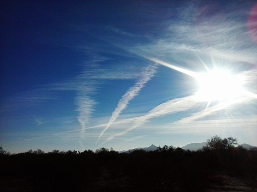
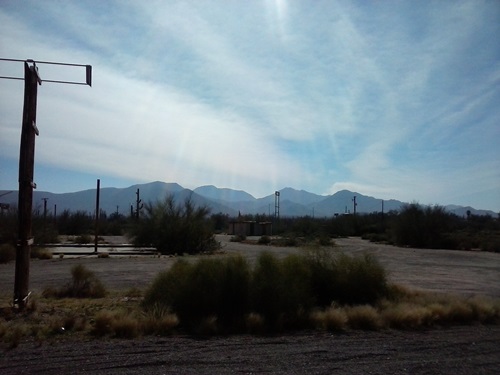
Typical Conditions for Non- Operational Day.
Sonoran National Monument – Stanfield AZ
Aerosol Operation – Early Hours
Jan 19 2016 – Sonoran National Monument – Stanfield AZ
Aerosol Operation – Mid-Day Hours
Jan 19 2016 – Sonoran National Monument – Stanfield AZ
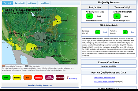
EPA Website Report at Location and Time of Aerosol Operation.
Jan 19 2016 – Sonoran National Monument – Stanfield AZ
Air Quality Index : Good
Forecast Air Quality Index : Good
Health Message : None
Current Conditions : Not Available
(“AirNow” 2016)
The PM 2.5 measurements that correlate with the above photographs are as follows:
With respect to the non-operational day photograph, clean air can and does exist at times in this country, especially in the more remote portions of the southwestern U.S. under investigation. It is quite typical to have PM 2.5 counts from 2 to 5 ug/m^3, which fall under the category of very good air quality by any index used. Low PM 2.5 counts are especially prone to occur after periods of heavier rain, as the materials are purged from the atmosphere. The El Nino influence has been especially influential in this regard during the earlier portion of this winter season. Visibility conditions of the air are a direct reflection of the PM 2.5 count.
On the day of the aerosol operation, the PM 2.5 counts were not low and the visibility down to ground level was highly diminished. The range of values throughout the day were from 2 to 57, with the low value occurring prior to sunrise and post sundown. The highest value of 57 occurred during mid-afternoon. A PM 2.5 value of 57 ug/m^3 is considered poor air quality by many alternative and contemporary air quality standards, and the prior discussions on mortality rates for “lower” concentrations should be consulted above. This high value has no corollary, thus far, during non-aerosol-operational days. From a common sense point of view, the conditions recorded by both photograph and measurement were indeed unhealthy. Visibility was diminished from a typical 70 miles + in the region to a level of approximately 30 miles during the operational period. Please refer to the earlier papers (Visibility Standards Changed, March 2001 and Mortality vs. Visibility, June 2004; also additional papers) for additional discussions related to these topics.
The U.S. Environmental Protection Agency reports no concerns, no immediate impact, nor any potential impact to health or the environment during the aerosol operation at the nearest reporting location.
Summary:
This paper has reviewed several factors that affect the interpretation of the Air Quality Index (AQI) as it has been developed and is used by the U.S. Environmental Protection Agency (EPA). In the process, several shortcomings have been identified:
1. The use of a color scheme strongly affects the perception of the index by the public. The colors used in the AQI are not consistent with what is now known about the impact of fine particulate matter (PM 2.5) to human health. The World Health Organization (WHO) acknowledges that there are NO known safe levels of fine particulate matter, and the literature also acknowledges the serious impact of low concentration levels of PM 2.5, including increased mortality.
2. The scaling range adopted by the AQI is much too large to adequately reveal the impact of the lower concentration levels of PM 2.5 to human health. A range of 500 ug/m^3 attached to the scale when mortality studies acknowledge significant impact at a level of 10 ug/m^3 is out of step with current needs by the public.
3. The underweighting of the lower PM 2.5 concentration levels relative to more contemporary scales that adequately emphasize lower level health impacts obscures health impacts which deserve more prominent exposure.
4. The AQI numeric scale is divorced from actual PM 2.5 concentration levels. The arbitrary scaling has no direct relationship to existing and actual concentrations of mass to volume ratios. The actual conditions of pollution are therefore hidden by an arbitrary construct that obscures the impact of pollution to human health.
5. The AQI is a historic development that has been maintained in various incarnations and modifications since its origin more than 45 years ago. The method of presentation and computation is obtuse and appears to exist as a legacy to the past rather than directly portraying pollution health risks.
6. The averaging of pollution data over a time period that filters out short term exposures of high magnitude is unnecessary and it hinders the awareness of the actual conditions of exposure to the public.
7. Presentation of air quality information through the authorized portal appears to present potential conflicts between reported information and actual field condition observation, data and measurement.
Recommendations:
In the opinion of this researcher the AQI, as it exists, should be revamped or discarded. Allowing for catastrophic pollution in the development of the scale is commendable, but not if it interferes with the presentation of useful and valuable information to the public on a practical and daily basis.
There is a partial analogy here with the scales used to report earthquakes and other natural events, as they are of an exponential nature and they provide for extreme events when they occur. It is now known, however, that very low levels of fine particulate matter are very harmful to human health. Any scaling chosen to represent the state of pollution in the atmosphere must correspondingly emphasize and reveal this fact. This is what matters on a daily basis in the practical affairs of living; the extreme events are known to occur but they should not receive equal (or even greater) emphasis in a daily pollution reporting standard. It is primarily a question of communicating to the public directly in real-time with actual data, versus the adherence to decades old legacies and methods that do not accurately portray modern pollution and its sources.
It seems to me that a solution to the problem is fairly straightforward; this issue is whether or not such a transformation can be made on a national level and whether or not it has strong public support. Many other scaling systems have already made the switch to emphasize the impact of lower level concentrations to human health; this would seem to be admirable based upon the actual needs of society.
It is a fairly simple matter to reconstruct the scale for an air quality index. THE SIMPLEST SOLUTION IS TO REPORT THE CONCENTRATION LEVELS DIRECTLY, IN REAL TIME MODE. For example, if the PM 2.5 pollution level at a particular location is, for example, 20 ug/m^3, then report it as such. This is not hard to do and technology is fully supportive of this direct change and access to data. We do not average our rain when it rains, we do not average our sunlight when we report how clear the sky is, we do not average the cloud cover, and we do not average how far we can see. The environmental conditions exist as they are, and they should be reported as such. There is no need to manipulate or “transform” the data, as is being done now. A linear scale can also be matched fairly well to the majority of daily life needs, and the extreme ranges can also be accommodated without any severe distortion of the system. The relationship between visibility and PM 2.5 counts will be very quickly and readily assimilated by the public when the actual data is simply available in real-time mode as it needs to be and should be. Of course, greater awareness of the public of the actual conditions of pollution may also lead to a stronger investigation of their source and nature; this may or may not be as welcome in our modern society. I hope that it will be, as the health of our generation, succeeding generations, and of the planet itself is dependent upon our willingness to confront the truths of our own existence.
Clifford E Carnicom
Mar 12, 2016
Born Clifford Bruce Stewart
Jan 19, 1953
References
“AirNow.” 2016. Accessed March 13. https://www.airnow.gov/.
“Air Quality Index | World Public Library.” 2016. Accessed March 13. http://www.worldlibrary.org/articles/air_quality_index.
“Air Quality Index – Wikipedia, the Free Encyclopedia.” 2016. Accessed March 13. https://en.wikipedia.org/wiki/Air_quality_index.
“Air Quality Now – About US – Indices Definition.” 2016a. Accessed March 13. http://www.airqualitynow.eu/about_indices_definition.php.
———. 2016b. Accessed March 13. http://www.airqualitynow.eu/about_indices_definition.php.
“FastStats.” 2016. Accessed March 13. http://www.cdc.gov/nchs/fastats/deaths.htm.
“HHTP21 Air Quality Meter, User Manual, Omega Engineering.” 2016.
Shi, Liuhua, Antonella Zanobetti, Itai Kloog, Brent A. Coull, Petros Koutrakis, Steven J. Melly, and Joel D. Schwartz. 2015. “Low-Concentration PM2.5 and Mortality: Estimating Acute and Chronic Effects in a Population-Based Study.” Environmental Health Perspectives 124 (1). doi:10.1289/ehp.1409111.
U.S. Environmental Protection Agency. 2012. “Revised Air Quality Standards for Particle Pollution and Updates to the Air Quality Index (AQI).”
Wong, Edward. 2013. “Beijing Air Pollution Off the Charts.” The New York Times, January 12. http://www.nytimes.com/2013/01/13/science/earth/beijing-air-pollution-off-the-charts.html.
World Health Organization. 2013. “Health Effects of Particulate Matter, Policy Implications for Countries in Eastern Europe, Caucasus and Central Asia.”
